Kitwood - Branding - 2014
A leader in the Kitchen and cabinet production in Lebanon, Kitwood is a brand that speaks detail and design. Our main goal was to uplift the brand’s image and make it as unique as possible. We focused on its main values and created an identity based on elegance, sophistication and perfection.
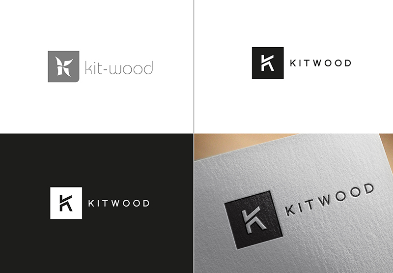
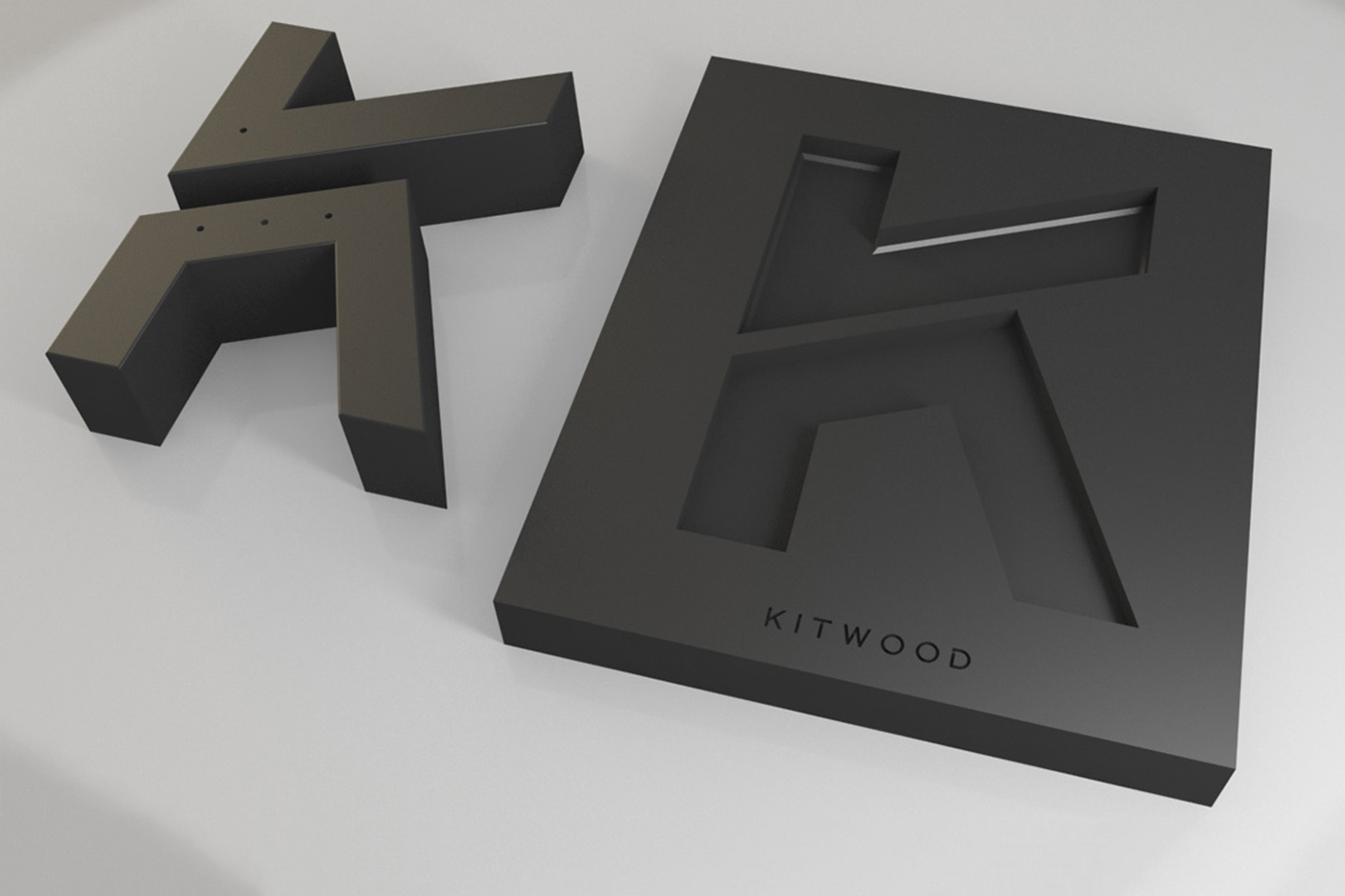
What says perfection more than 4 equal sides and 4 right angles? We adopted a perfect square to re-dress the new Kitwood emblem.
The square will symbolize a surface in both horizontal and vertical planes. The square is a stable symbol. It is all about the physical world. It is a shape that most people trust. The square has straight lines and right angles that symbolize order and being rational.
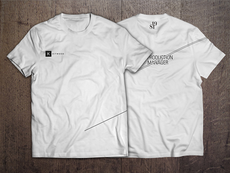
With a minimal contrast between black and white, and sleek cuts, Kitwood possesses an image that is proof of its sharp leadership and position in the market.